A cybersecurity dashboard is a graphical user interface that displays real-time data about the security of an organization’s network and systems. It typically includes a collection of metrics, charts, and other visualizations that provide a high-level view of an organization’s cybersecurity posture. The dashboard may include information about the number of attacks, the types of attacks, the systems that were targeted, and the success or failure of those attacks. Some dashboards may also include alerts or notifications about potential security incidents or vulnerabilities. The purpose of a cybersecurity dashboard is to give security analysts and other stakeholders a quick and easy way to monitor the security of their network and systems and to take action if necessary.
Security-specific tech solutions often display data that is very technical and doesn’t provide a complete picture of risk. This can be challenging for less-technically skilled individuals on the board and in the C-suite who are responsible for cybersecurity oversight. To help these individuals better understand and communicate cyber risks, it can be useful to provide more straightforward, aggregated information that is easy for everyone to understand.
We have compiled a list of cyber risk KPIs under a few categories that can be integrated into a dashboard for any member of an organization who wants to become more aware of cyber risk. These metrics come from a variety of sources and cover a range of risks, including technical issues, security diligence, and human behavior.
1. Security Posture rating/Benchmark
Security posture refers to the overall level of security protection that an organization has in place to defend against potential threats and vulnerabilities. It would be good to compare your security posture with industries and identify gaps.
To achieve this, you could summarize the discovered issues below or request third-party service to provide a benchmark report.
2. Assets
Show the list of assets that are under your coverage. For example, the number of
- device
- mobile devices
- employee
- cloud instances
- email inbox
- Ips
- Applications
- Third-party vendors
- etc.
- Percentage of devices/assets that are not monitored or scanned for vulnerabilities
3. Incident & Detection & Response
Show the metrics related to security operations.
- Number of real incidents
- Number of detections/day (break them by severity level)
- Mean time to detect
- Mean time to response
- Mean time to resolve
- Cases left open
- Top detection type
- Detection Gaps in MITER attack framework
- Time of the monitoring stopped due to system failure
You may also want to highlight a few notable incidents and top users/machines that have the most issues. Be prepared with metrics along a timeline so that you can reveal the trend, and the needs and guide the planning.
4. Vulnerabilities
- Number of vulnerabilities
- Number of Patches
- Mean time to Patch
5. Compliance & Audit
- Type of compliance
- How many audits have been finished?
- How many audits are left?
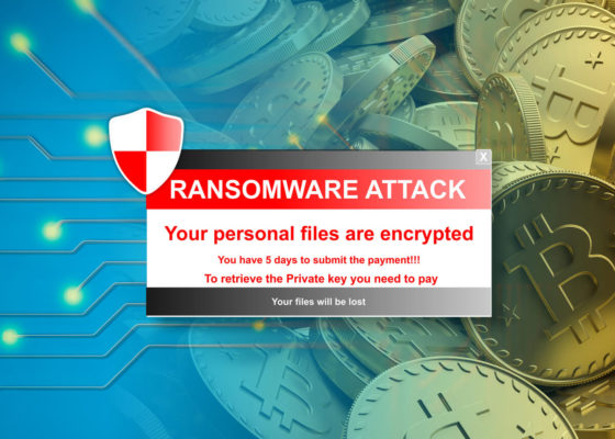
It is also worth adding a few specific controls addressing threats such as Ransomware
- What percentage of devices are backed up frequently
6. Security Training
- How many phishing tests and what’s the average click rate?
- What is the security awareness training completion rate?
7. Cost & Value
Keep cost and value in your monitoring/reporting when needed.
Referring to cost, there are two parts.
- Labor Cost
- Analyst performance
- Time is taken to investigate each incident
- Technology Cost
- if the incident happened, what extra technology/service you used to mitigate the incident
Regarding Value, focus on $ saved/loss prevented.
How to do that? Here are two things you can leverage
- Past Incidents
- Reporting from other orgs, news
Here are a few examples of implied values: Loss Prevention
- Incidents that were escalated to legal counsel, law enforcement
- Incidents handled that clobbered competitors
- The direct value of IP caught in exfil
- Value of systems not being bricked from EFI bootkit